
Design that
does not look
borrowed.
OG Web.site builds branded websites that hit harder on the first screen, move cleaner through the pages and launch without the usual handoff mess.

A harder-edged product site with a stronger visual identity and a clearer route from first impression to action.

A support-led platform shaped around trust, recognisable branding and easier access to help-led content.
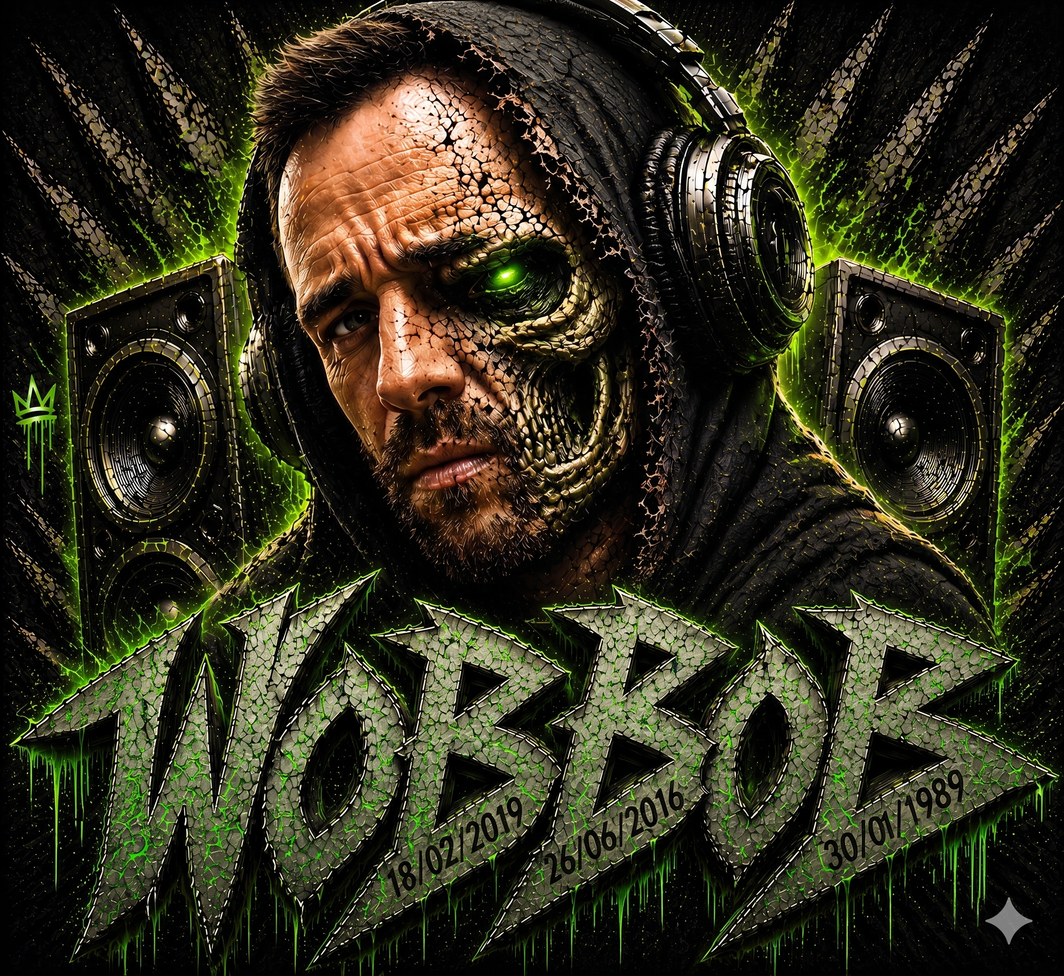
A more personality-heavy direction where the brand identity needs to feel owned, loud and immediately memorable.

A more conversion-focused sales site designed to move users quickly toward quote and contact action.
One build chain.
No split responsibility.
The header, first screen, page order and call-to-action path are mapped around the business first, so the site launches with its own identity instead of a recycled layout.
Home, services, portfolio, hosting and contact are built as separate routes with responsive layouts, stronger hierarchy and a cleaner route from landing to enquiry.
The live setup gets handled with the build, including deployment, SSL, DNS, contact forms and email routing, so the job does not stop at the mock-up.
Once the site is live, updates stay with the same builder, so text changes, new sections and fixes do not vanish into a generic support queue.
Stronger first screens.
Cleaner page flow.
The work stays sharper when the design direction, the code and the launch setup are all solved together instead of being passed around.
The structure, tone and first screen are resolved before the build is pushed live, so the site launches with an actual point of view.
Design, code, domain setup, hosting and forms are handled as one system instead of being split across suppliers.
The same person who built the site stays close enough to keep it sharp after launch instead of handing it off to a ticket queue.
the fix is a real rebuild.